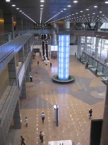
On Wednesday, during a break in the conference (they scheduled half-hour breaks between speakers, which I think was intended to give people lots of time to go look at the exhibits, network, etc.), I was walking around the entrance hall of the Suntec convention center, and taking pictures of the water sculpture-slash-fountain.
via flickr
It’s hard to see, but the sculpture has water running down the sides.
via flickr
It also has lights that change color. And it’s big. So it hits the triefcta of Singaporean public sculpture.
As I walking around the floor, I noticed that the tiles seemed to make a map of South Asia.
Technorati Tags: Buckminster Fuller, Singapore, travel
There was a little metal button where Singapore is.

via flickr
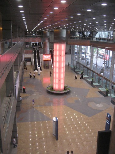
But something was weird about the projection: things curved off in unusual ways.

via flickr
Finally, it hit me: this is a gigantic Dymaxion Map– the map projection developed by Buckminster Fuller in the early 1940s!

Dymaxion Map, from Katy Borner’s excellent Places and Spaces exhibit.
It’s a gigantic map, and walking across it– once I realized what it was– was a strange, thrilling experience. You get a much better sense of just how amazingly massive Eurasia is compared to the Americas, and how great the distance is between, say, the coast of China and the coast of France– but also how it’s possible to cross that distance by land.

Antarctica is in the upper left, North America is on the far right, and the Bering Strait is just to the right of the fountain. Eurasia stretches behind and to the right of the fountain; Africa is partially obscured by the fountain. via flickr