There are several things I’ve had to learn while transitioning from giving academic talks to doing broader talks. Here are the big ones.
Don’t just read your papers
Lots of seminar talks and conference papers are just things people have published or written for publication, written aloud. Arguably there are seminars where this is okay. If speaker and audience share an assumption that part of the purpose of a seminar is to get feedback on a paper that’s bound for publication, for example, then reading a paper makes some sense.

But too often the result is not a talk in which the audience able to think both about the argument the speaker is making, and how it would read (which is a bit of a cognitive load). The result is a dull talk.
Simplicity doesn’t mean dumbed-down
I’ve never made a talk worse by making fewer important points, or by simplifying the story I’m trying to tell.

Too often, telling yourself that you’re presenting a complex multilayered story that really can’t be reduced to something clearer and simpler is a recipe for a talk that’s incoherent and overburdened. Talks that are so achingly brilliant they’re over your head, and talks that are incomprehensible because they’re poorly written, sound pretty much the same, and have the same impact on your audience– namely, none.
Further, the complexity that people might be able to handle in print– the sort that is manageable with paratexts and an ability to flip back and forth in a document– becomes unmanageable in a talk that they’re listening to. You need to apply a different kind of standard to popular talks.
Put another way, it’s better for your audience to remember one or two big points from your talk, than to forget five.
But if you know what you’re doing, two points are as many as you need to make.
Creating a talk that will be memorable– not just one that’s well-delivered, but one whose big points a listener can explain to someone else over dinner the next night, or one that both stands on its own and creates a desire in your audience to learn more– requires trading complexity for a specific kind of simplicity.
This is not the simplicity of a children’s story, nor is it the simplicity that comes from sacrificing evidence on the altar of a counterintuitive-sounding but ultimately conservative argument. It’s the simplicity that product designers and Zen gardeners strive for: the version that strips away everything that doesn’t matter, and works in a fashion that is clear and unadorned.

That kind of simplicity, as anyone who’s tried to create it, isn’t just achieved by using simpler words or talking down to your audience. It’s only achieved when you understand your subject so well you see its essence, and can describe it clearly. Audiences sense that.
Make your slides interesting
Never put words on a slide, and then read the words. Don’t even do bullet points. Use pictures.
People who are scared of public speaking fill their slides with text, then read the text. They rationalize it by claiming that these are really important points, different learning styles, blah blah; but I’ve never seen a speaker wow an audience by reading along with them.
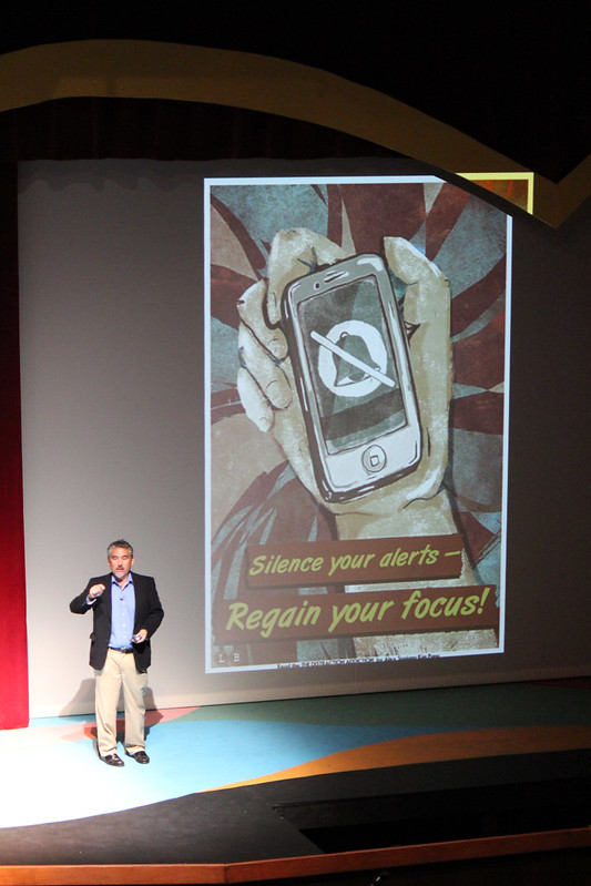
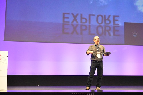
The slide above has the largest number of words I ever use. Three words on a slide is usually too many. You can get away with two, if they’re short words.
Personally, I like single words (especially if they’re “found words,” from street signs, movie posters, and the like) that underline a point, or appear in a key phrase.
If a word appears onscreen, you need to actually say it; having a word visible sets up an expectation in the audience, a tension that only you can resolve. (It also very subtly reminds everyone who has the power here.)

The rest of my slides are single images, without captions.
I only use pictures I’ve taken myself. When you use your own images, you own your images and don’t have to worry about rights and permissions; it also means your talk is going to have a unified look and feel, a wholeness that will make it more compelling and convincing.
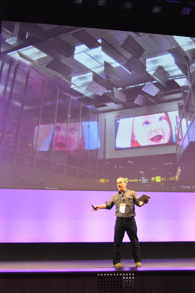
The fact that I tend to shoot things a little off-center, take lots of landscape and architectural pictures at dusk or in the evenings, and use either a really good digital SLR or Hipstamatic, means that my talks have a distinctiveness that they would lack if I was just pulling pictures off Flickr. (Lots of my photos also have bicycles at the edges or in the distance. Using several together creates a visual continuity, even if people aren’t entirely aware of it.)

Keep it simple
Don’t use fancy transitions, animations, or other tricks. Don’t even dissolve or swipe. Just go from one picture to another. If you have text, make it Helvetica. Helvetica is nice. Every computer can handle Helvetica.
Why? Because you want your talk to work on any presentation machine, no matter what. If it can handle electrons, it should be able to run your talk. Even if you have a high degree of confidence that the tech people at the venue will have exactly the machine you want, don’t tempt fate.
Posts in this series: